Hospital billing data release grabs headlines
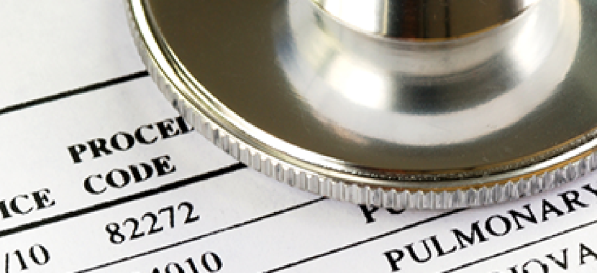


The data set reveals a wide variance in hospital billings for similar services.

Big data is a hot topic, but rarely is the release of an individual dataset front page news. On May 8, however, The New York Times, the Washington Post and the Huffington Post all featured detailed stories peering under the hood of what's known as the "chargemaster" list of healthcare prices -- essentially the sticker price for medical procedures charged by hospitals.
The data, made available in spreadsheet form by the Centers for Medicare and Medicaid Services, show a wide variance in what hospitals bill for similar services, even among facilities in the same region or city. The three news organizations that got an advance peek at the dataset were able to create maps and charts that drill down on some of the pricing variations among providers. The information covers charges from 2011 at 3,300 hospitals.
The prices listed are more of a starting point for negotiations with private insurance providers and government, not what insurers and CMS actually collect for services, but they are bound to spark discussion of what constitutes reasonable charges for medical services.
The Health and Human Services Department is seeding that discussion with $87 million in grant opportunities, also announced May 8, to use the price data to create online consumer-facing "pricing centers" to crunch the chargemaster numbers on a state-by-state basis. In addition, the Robert Wood Johnson Foundation is planning a "data visualization challenge" to fund applications created out of the newly released chargemaster dataset.