Using data visualization in government
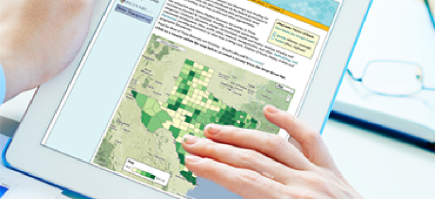
An IBM Center for the Business of Government report explores ways to turn data into visual representations.

IBM's Center for the Business of Government has issued a report on the best ways to visualize data. Click here to download the report.
What: The IBM Center for the Business of Government’s report on the use of data visualization in government.
Why: As the amount of available data continues to multiply, visualization is increasingly vital to agencies' ability to analyze the data they have. The best visualizations help viewers understand the meaning of data, and this report shows what tools can be used to create such visualizations. It includes case studies of how data visualization is being effectively used at federal, state and local levels.
Verbatim: “Even with these more sophisticated means of analysis, government managers still have the challenge of explaining issues and results to decision-makers and the public; that is where data visualization comes in. Numbers and patterns can be more readily grasped in graphic visualization, particularly when interactive. Data visualization can help citizens understand data and data analysis more readily through graphic presentations. It is a tool to connect data with citizens and foster citizen engagement.”
Full report: Click here
NEXT STORY: Security clearances at a glance